Agriculture
September 2024
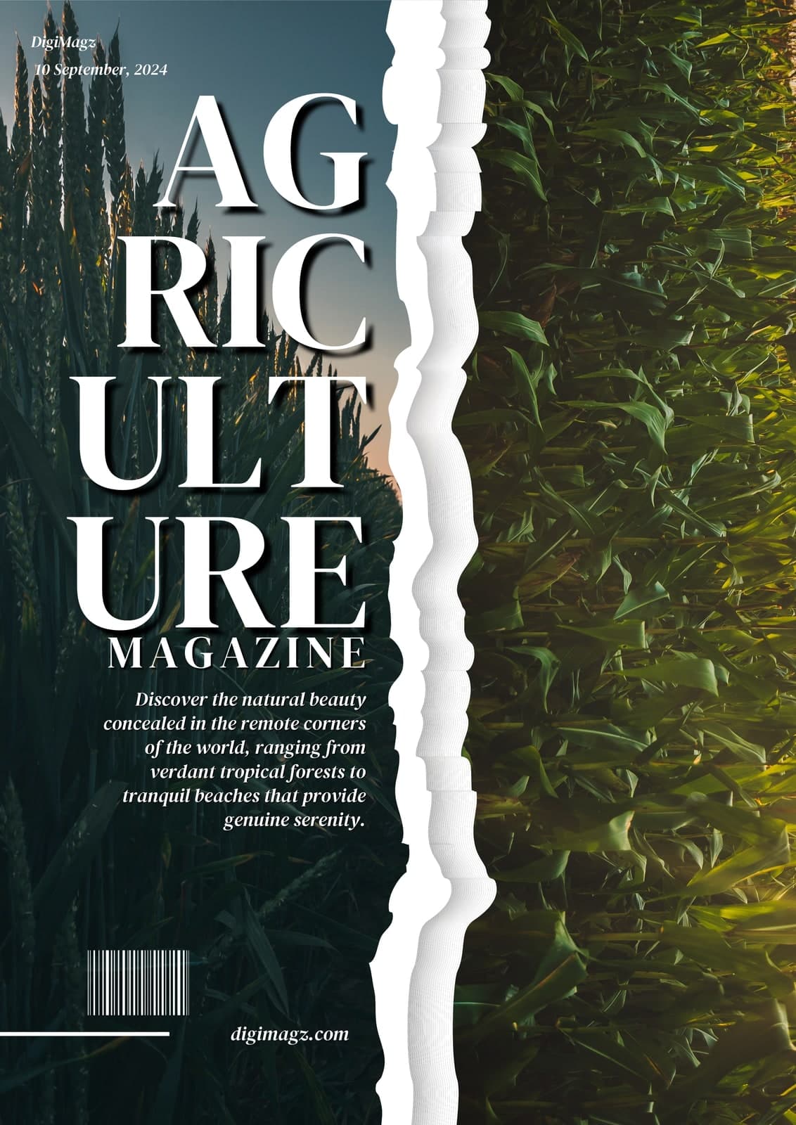
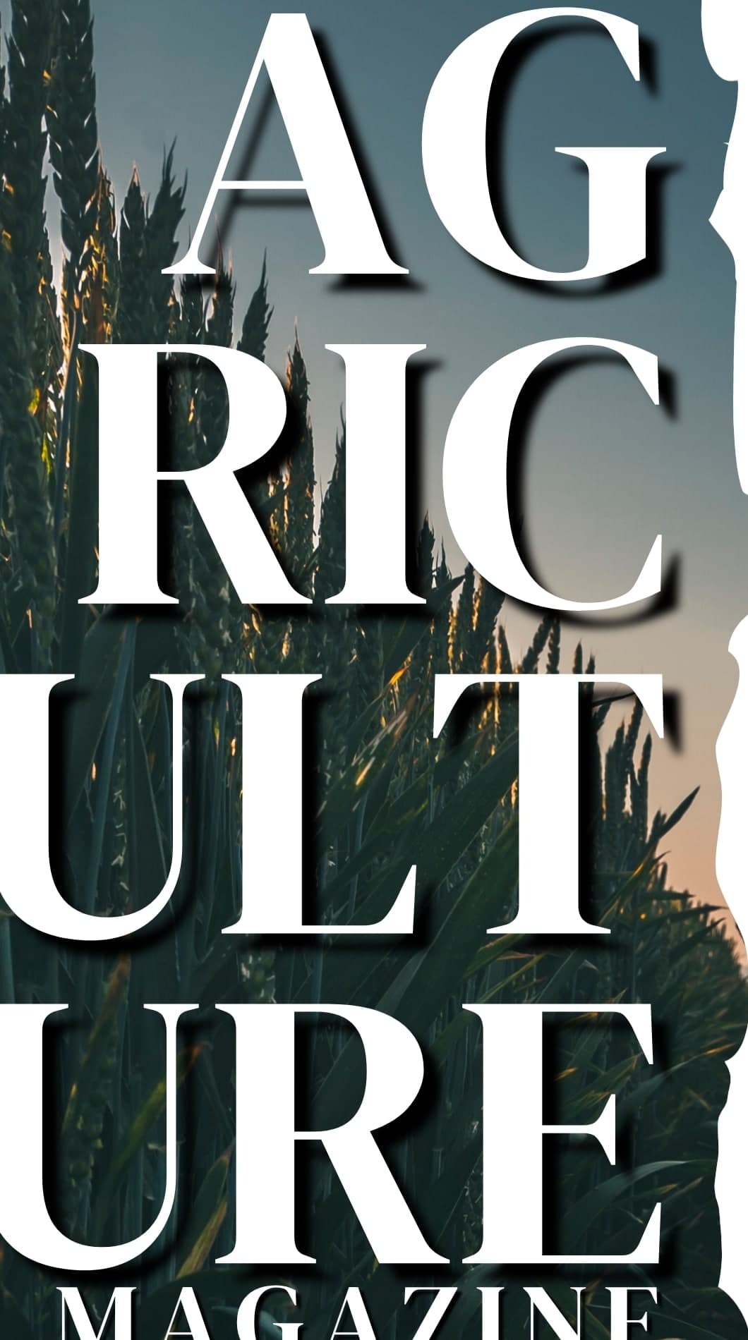
A long word is the quiet enemy of cover design. AGRICULTURE will not sit across a page at any size worth having, and shrinking it to fit is how a title stops looking like a title.
This specimen takes the opposite decision — break the word, stack it, and let it run the full height of the page as the dominant element.
- Format
- Trade title
- Extent
- Cover
At full size

Decisions
The masthead is set vertically
Broken across five lines in a high-contrast serif and run down the left third. At this scale the word is unmistakable even though no single line is complete, and it gives the cover a spine rather than a banner.
A torn edge, not a straight one
Two photographs meet down the middle. A ruled join would read as a template; a torn white edge reads as paper, which is the association a print title wants even when it is delivered as a PDF.
One serif doing all the work
Masthead, standfirst and imprint are the same family at three weights and two styles. No second typeface is introduced, so the cover holds together without a rule or a box anywhere on it.
The standfirst is right-ranged against the tear
Set ragged-left so its edge echoes the torn join rather than fighting it — the kind of alignment decision nobody notices and everybody feels.
Other approach notes