Frontiers
March 2026
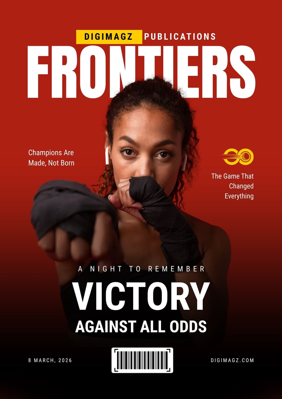
One subject, one colour, and a masthead that cannot be allowed to lose. It is the opposite problem to a cover carrying four images: here there is nothing to hide behind, so every decision is visible.
It is the specimen to look at if your publication leads on people — a profile issue, an awards edition, a founder interview.
- Format
- Consumer title
- Extent
- Cover
At full size

Decisions
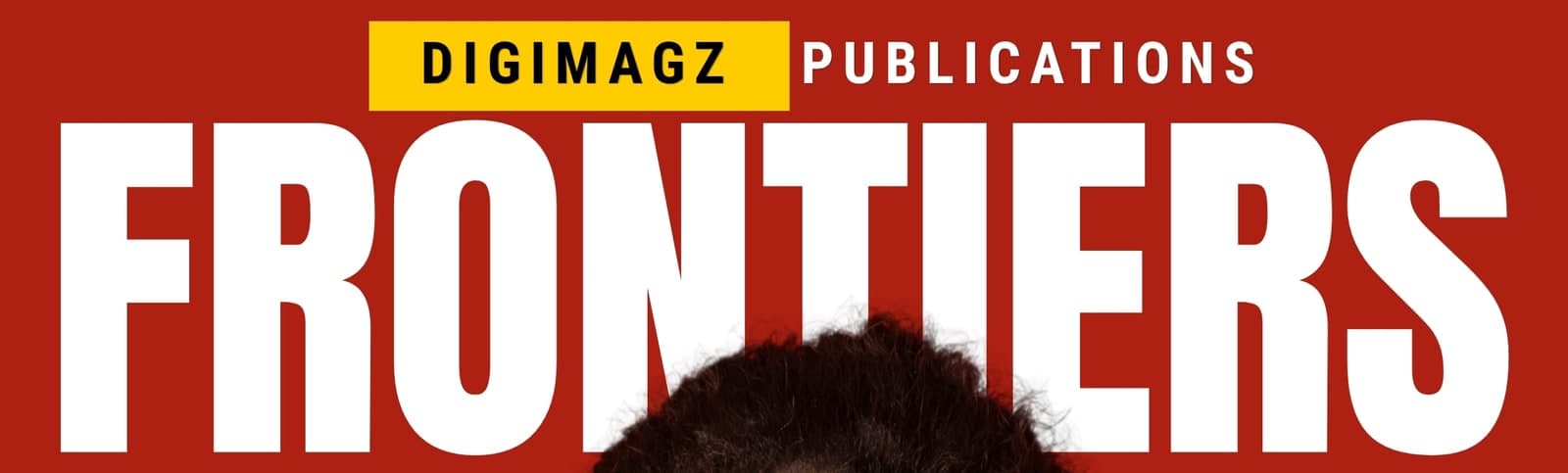
The subject breaks the masthead
Her hair crosses in front of FRONTIERS. It is the oldest trick on a newsstand and it still works: the eye completes the word, and the overlap puts the person in front of the title rather than pasted onto it.
One red, one yellow, nothing else
A single yellow block behind the imprint is the only accent on the cover. Restricting the palette to two colours is what lets the photograph carry the page instead of competing with it.
Cover lines in the negative space
Two short lines sit left and right at eye level, in the empty red either side of the subject. No boxes, no rules — the composition already left room for them.
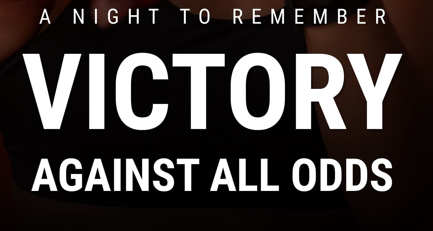
The headline sits where the image goes dark
The photograph falls away to near black at the bottom third, so the largest type on the cover needs no panel or shadow to stay legible. The gradient does the work.
Other approach notes