Tarangini Industries
Annual Report 2025
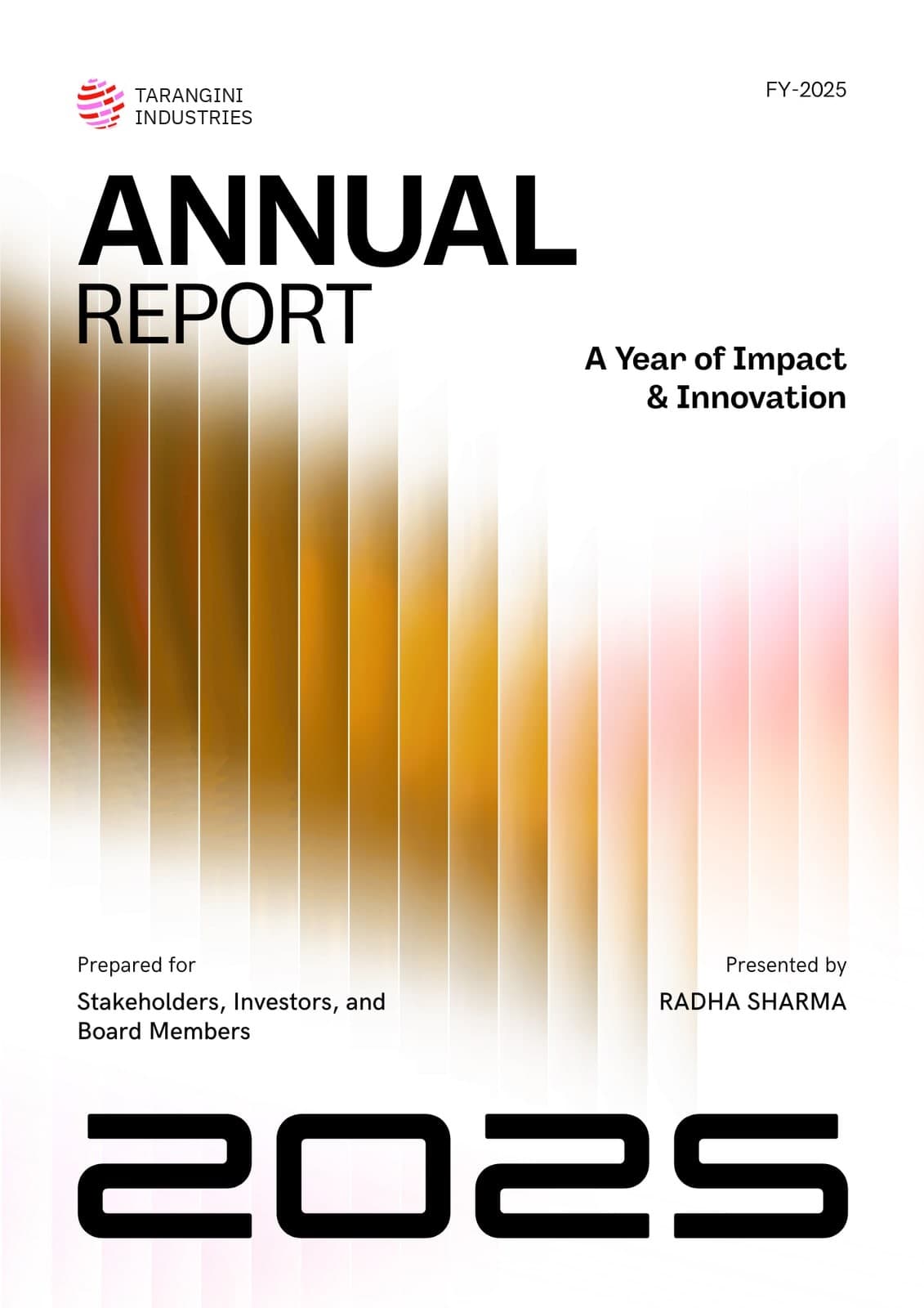
Annual reports are usually handed a stock photo of a handshake or a skyline. This cover goes the other way and treats the report as a typographic object, which is how a board actually picks it up: by title and year.
The colour field gives it warmth and movement without showing anything that could date it or look like everyone else's report.
- Format
- Annual report
- Extent
- Cover
At full size


Decisions
Colour as texture, not as a picture
Warm ochre-to-pink gradient, sliced into evenly spaced vertical strips with fine white gaps. It suggests a bar chart and a curtain at once, and it fades to white top and bottom so the type never sits on anything busy.
ANNUAL in black, REPORT in light
The same family at two weights. The heavy word carries the shelf presence; the light one stops the title turning into a slab.
The year is the image
2025 runs the full width of the foot in a squared display face. On a shelf of reports from several years, it is the one thing a reader needs to find, so it is the biggest thing on the cover.
Who it is for, who it is from
Prepared for and Presented by sit in two aligned columns above the year, in the same small size as the FY-2025 tag top right. Formal information, set quietly.
More work
- Nature
- Frontiers
- Agriculture
- It's My Day
- Pune Fashion Trends
- The Hour
- Homecoming
- Ninety Years
- Saat Phere
- Rasoi
- Sehat
- The Banyan
- aangan
- Kaveri Softworks
- Second Innings
- Taal
- Vivah
- Safar
- Noor
- Sitara
- Sonchafa, Baner
- Sanjha Woodworks
- The Tanvi & Arjun Chronicle
- Panghat Foundation
- Prakaar
- Tej
- Field Heat
- Field Heat, the letter
- Jharokha, the letter
- Jharokha
- Prahar, Koregaon Park
- Nuajibana Trust