It's My Day
June 2026
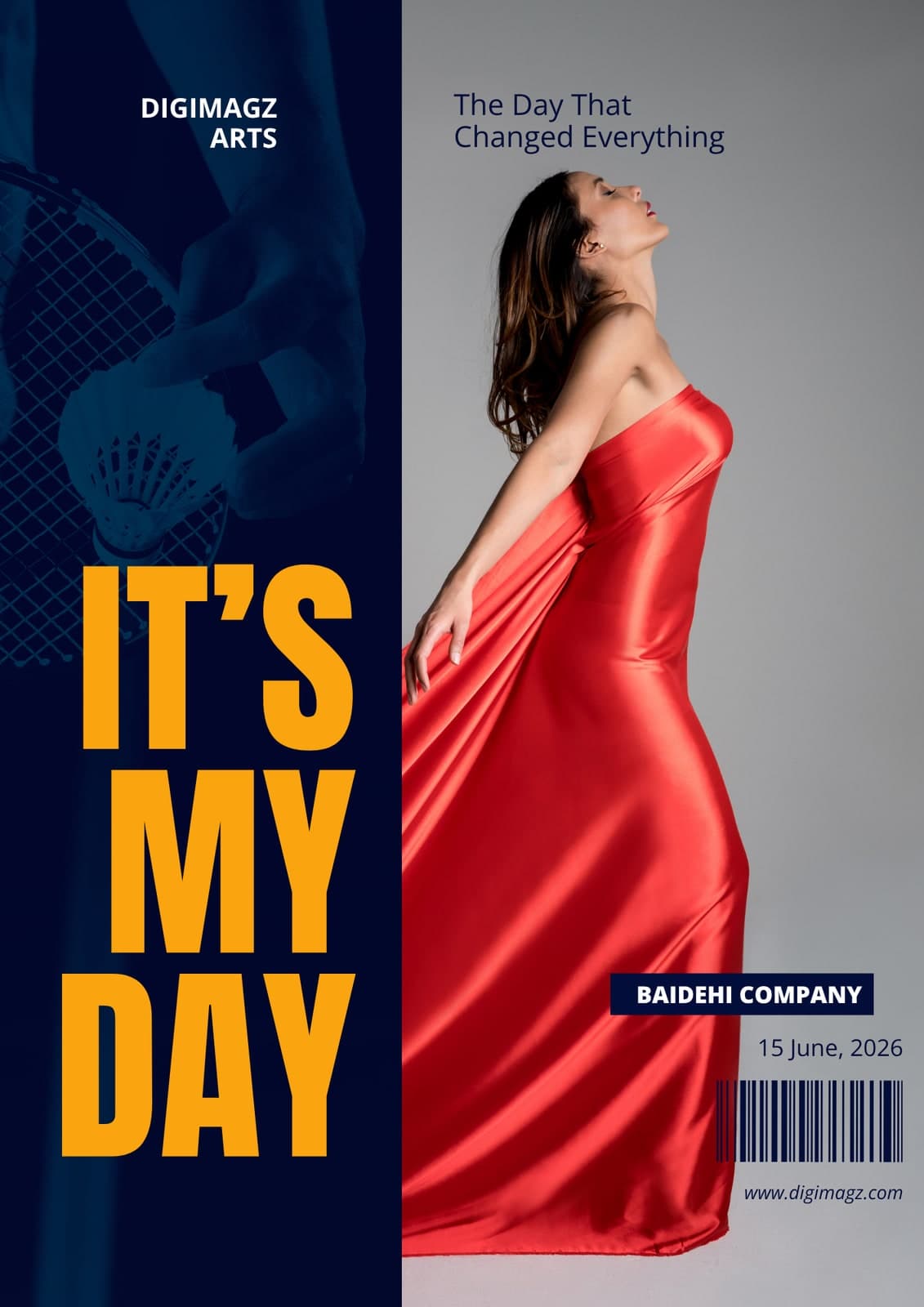
Two images that have nothing in common, both of which have to stay on the cover. Blend them and you get mud; box them and you get a brochure.
This specimen takes the third option: a single uncompromising vertical split, with the two halves treated so differently that the join reads as a decision rather than a compromise.
- Format
- Arts title
- Extent
- Cover
At full size

Decisions
One half is pushed back to texture
The racket frame is reduced to a navy duotone so it stops competing for attention and becomes a ground the title can sit on. The portrait keeps full colour and carries the eye on its own.
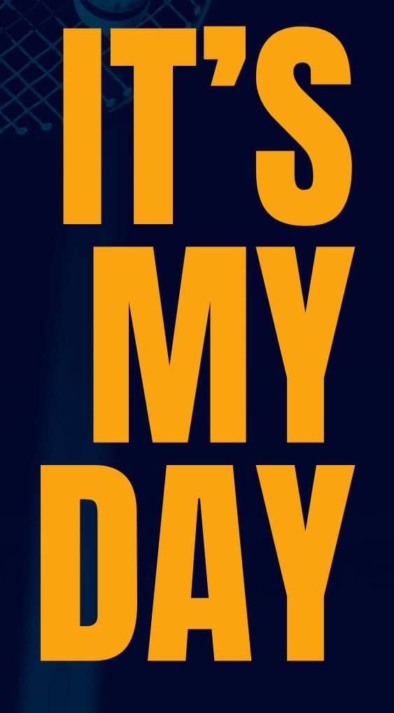
The title lives entirely in the flat panel
Condensed caps in three stacked lines, set in the calmest part of the cover. Nothing overlaps it, so it needs no shadow, outline or panel to stay readable at any size.
Two saturated things, and no more
The yellow title and the red dress are the only fully saturated elements on the page. Everything else is navy or grey, which is why the two of them read across a room.
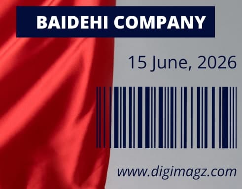
The imprint is plated, the rest is ranged right
The company name sits on a solid navy plate where the background is busiest; date, barcode and address range right into the clean grey below it, where no plate is needed.
Other approach notes