Nature
Issue 3, Vol. 12
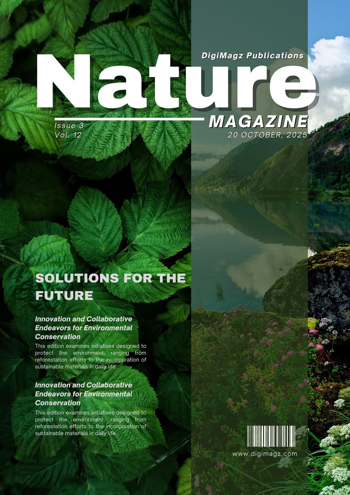
The brief a cover like this actually sets is a competition for attention: a masthead that has to dominate, four photographs that all want to be the image, and enough cover lines to tell a member what is inside before they open it.
Most covers solve that by shrinking the photography until it is decorative. This one keeps the images at full strength and wins the masthead back with scale and a tinted panel instead.
- Format
- Membership magazine
- Extent
- Cover
At full size

Decisions
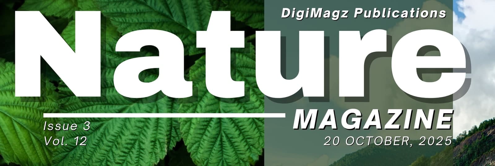
A vertical panel, not a drop shadow
The masthead crosses four images of very different brightness. Rather than outlining or shadowing the type, a single tinted panel runs the full height of the cover and gives every element that sits on it a predictable ground.
Photography split, not collaged
Four images divided by hard vertical edges read as one deliberate composition; the same four feathered together read as a mistake. The leaf macro takes the largest share because it is the only one that survives type on top of it.
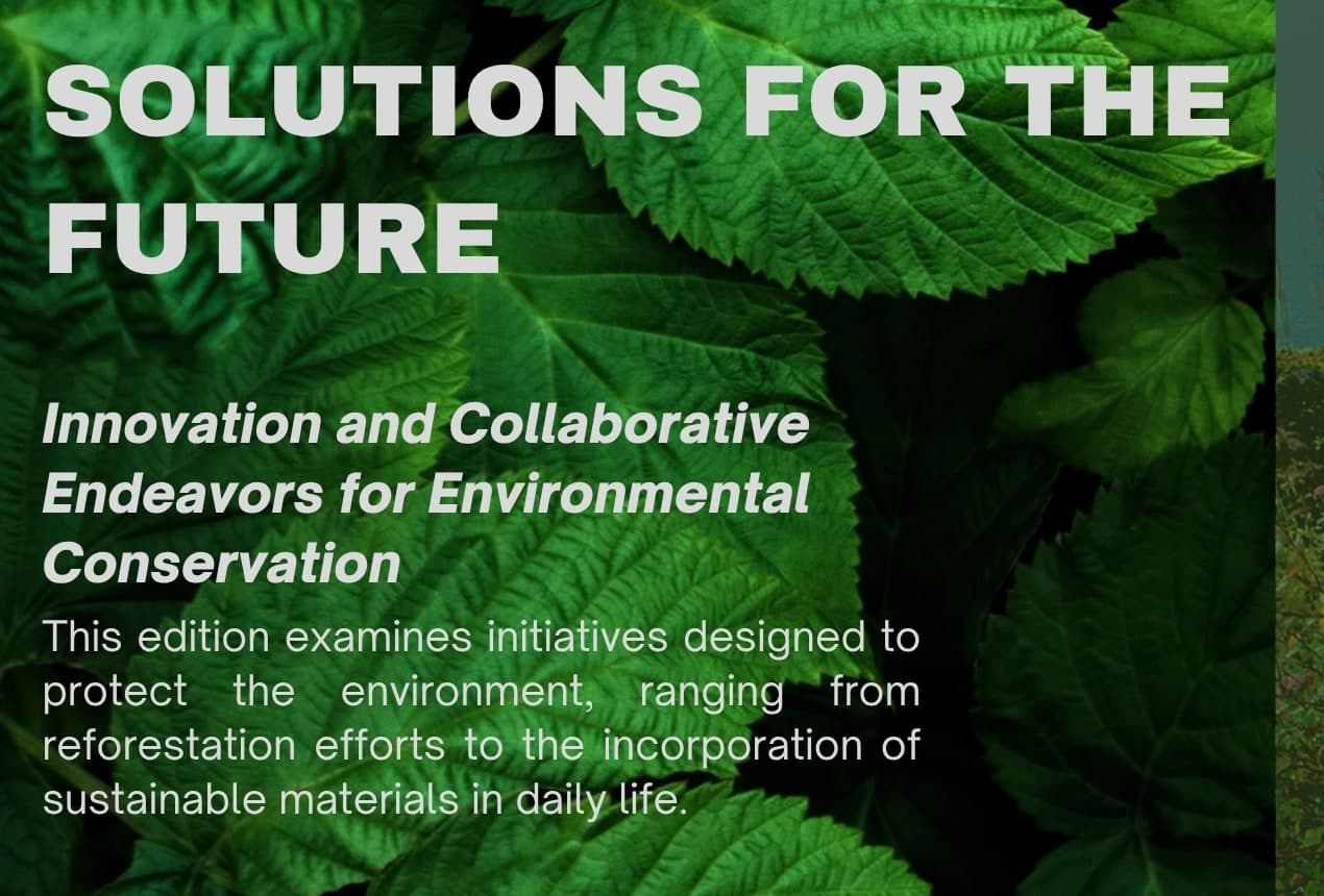
Cover lines set as a hierarchy of three
Section head, italic headline, justified standfirst. It repeats twice without becoming monotonous, and it gives the member a real summary rather than a teaser.
Imprint kept at the foot
Barcode and address sit in the quietest corner of the busiest image, where they are findable and never compete with the cover lines.
Other approach notes